Showing posts with label C. assignment two: TV adverts. Show all posts
Showing posts with label C. assignment two: TV adverts. Show all posts
Wednesday, 29 June 2016

Saturday, 6 February 2016
Analysis of editing techniques
History and development of film
 Editing is the post production part of film making and is how visual and audio material is combined. It's purpose is to make a sequence in order to present a narrative or idea to the audience and create a visual art form. Not every media text has a constant narrative and meaning is usually created through how it is edited instead. This idea was demonstrated by Lev Kuleshov in 1910 and his use of cuts between someone facing the camera and then the thing the person was looking at to create emotion and meaning within the shots.
 Editing has changed dramatically over the years with the basic 'cut' originally meaning to physically cut the film and splice together again. Nowadays all editing is done digitally as it is much more practical than cutting and splicing bits of film by hand. Also digital editing allows non-linear editing as it gives you the ability to edit footage in whatever order you want as you can upload footage and access it whenever you want. However editing with film includes linear editing involving editing tape to tape with everything being edited in order. There are also other transitions used other than the normal cut to the next shot such as dissolve, fade, wipe etc. A fade out is where the shot turns to one colour (typically black) and a fade in is when the picture gradually appears on the screen. A dissolve is similar with the visibility of the picture gradually changing. Finally, a wipe involves one shot replacing another.
In early filmmaking there weren't any set rules. However gradually a system was developed in filmmaking which was designed to create an effortless effect and ensure there is no confusion for the the audience. This is now known as the continuity system and it is made of a series of rules to follow. These rules include establishing shots, the 180 degree rule, shot-reverse-shot, match cuts on action and eye line match-cuts.
http://btecmediaen1.blogspot.co.uk/search/label/C.%20Assignment%202%3A%20Television%20Advertising
Visual analysis
http://btecmediaen1.blogspot.co.uk/search/label/C.%20Assignment%202%3A%20Television%20Advertising
Visual analysis
At 0:54 there is an establishing shot. This is a shot that is typically the first shot of a new scene and it's purpose is to set the scene by showing the audience where the action is happening. Usually establishing shots are wide shots so that the can fit in large landscapes or buildings. In this particular extract the shot starts off as a wide shot and then pans in to show the audience where in particular the next shot and the action is taking place.
http://www.mediacollege.com/video/shots/establishing.html
http://www.mediacollege.com/video/shots/establishing.html
 At 2:38 and 2:46 is an example of a shot-reverse-shot. This is a technique used to show two characters interacting from both sides giving the audience better spacial awareness of where the characters are positioned. It also builds tension and excitement as in this example the audience can see what is about to happen and then after see what the effect of what happened was on the other character. This shot was successful because it also follows the 180 degree rule. This rule outlines the rules for the on screen relationship being established between two characters. When considering the 180 degree rule you must imagine there is a line between through the characters and the camera must not pass onto the other side. This is to ensure there is no confusion about where the characters are positioned.
https://en.wikipedia.org/wiki/Shot_reverse_shot

At 4:16 and 4:17 are match on action shots. This is where action begins in one shot and ends in the next. The shot is taken from a different view point but matches whatever is happening in the first shot. The purpose of this technique is to create an idea of continuous time for the audience and makes the cut smoother by making it less noticeable. In these shots the robber reaches for volt lock and then it cuts to him spinning the lock round.
http://www.slideshare.net/joe940/match-on-action-180-rule-shot-reverse-shot
 At 3:31 and 3:32 is an eye-line match cut. This is where the first shot shows someone looking out of the frame and then it cuts to the second shot shows the audience what they are looking at. In this case the man is looking at one of the robbers who is out of the frame and pointing a gun towards him. In the second shot you see the robber on the floor and the bullet nearly hit him. This is also a point of view shot as the camera is positioned from the mans point of view when it cuts to the shot of the robber on the floor. It also pans along as the robber is trying to get away, giving the impression that hes walking and the shot is literally from his point of view. A POV shot is a camera and editing technique that helps the audience feel as though they are looking through the eyes of the character.
https://en.wikipedia.org/wiki/Eyeline_match
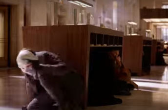 At 3:31 and 3:32 is an eye-line match cut. This is where the first shot shows someone looking out of the frame and then it cuts to the second shot shows the audience what they are looking at. In this case the man is looking at one of the robbers who is out of the frame and pointing a gun towards him. In the second shot you see the robber on the floor and the bullet nearly hit him. This is also a point of view shot as the camera is positioned from the mans point of view when it cuts to the shot of the robber on the floor. It also pans along as the robber is trying to get away, giving the impression that hes walking and the shot is literally from his point of view. A POV shot is a camera and editing technique that helps the audience feel as though they are looking through the eyes of the character.
https://en.wikipedia.org/wiki/Eyeline_match
 Screen time is distributed usually depending on who the main character/s are in that scene. For example in the clip above the camera is mainly following and focusing on the robbers rather than anyone else in the scene. Also the first clip focuses on one robber in particular using longer shots at 1:28 and 2:05. This is because he is revealed to be the main antagonist in the story and therefore needs more screen time for the audience to form relationship with the character.
In the clip a variation of editing techniques have been used to add suspense and excitement as well as to construct the story line. They have used a lot of different shot variation such as at 1:23 the shot
goes from a long shot to a mid close up. This is effective as the long shot focuses on the character and the close up helps the audience direct and focus their attention on the mask. Both the character and the mask is later revealed to have significance as he is actually the main antagonist. This is an example of providing and withholding information which is also another technique used to generate suspense.In this particular example of withholding information the jokers identity is cleverly hidden from the camera when he has his mask off as the shot is from behind. This is done on purpose as the beginning of the storyline depends on his identity being hidden.
http://expertinediting1.blogspot.co.uk/2012/06/shot-variation.html
http://esraelalem.blogspot.co.uk/2010/10/providing-and-withholding-information.html
 This scene also exemplifies the use of parallel editing as it keep switching between the different robbers and what they are doing. Parallel editing is where it is alternating between two or more scenes that are happening at the same time. It's purpose is to create tension as the audience can see all the action that is simultaneously happening. In this clip the cutting between the different action is vital in creating suspense for the end of the scene when the joker is revealed. At 2:55 a cutaway shot has been used. This is a shot of something outside of the main action but is still related to what is happening. In this case the robbery is taking place but it cuts to a shot of the man still in his office looking concerned. Cutaway shots act as a reaction shot and helps the composition of the film. Editing rhythm is used to create pace within the film. Slow cuts create a more calming feel whereas fast cuts indicate excitement and action. In the clip this is editing rhythm has been used to build tension by using quick cuts between the different robber and what they are doing.
http://www.elementsofcinema.com/editing/parallel-editing/
http://www.videomaker.com/article/13850-the-art-of-the-cutaway
http://rachelhubbell.blogspot.co.uk/2011/02/editing-rhythm.html
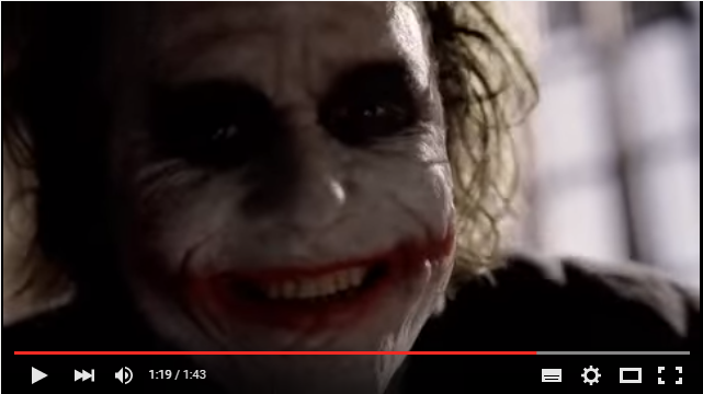 As you can see from the clip many of the continuity system rules as well as various different types of shots are shown. However there were a a couple of important shots that they did not use in this clip. These shot types were a close up and a reaction shot. Here is an example of a close up from another clip from The Dark Knight. In this part of the film they have used a close up shot. A close up tightly frames an object or person and focuses on it. They have used this shot to display more detail of the Jokers scary image to create tension.
https://en.wikipedia.org/wiki/Close-up
 In this very famous scene from Psycho they have used a reaction shot. This shot is used to capture emotion in facial expressions. It's achieved by cutting away from the main action to typically a close up of a facial expression reacting to something.
http://www.elementsofcinema.com/editing/what-is-a-reaction-shot-in-movies/
The clip also doesn't show a few important editing techniques such as montage, cutting to soundtrack, multiple points of view and jump-cuts. I have found examples of each of these techniques in various clips below. Firstly a montage is where different clips are put together and are usually edited to a fast pace to construct the idea of time passing. In this clip from Rocky montage editing has been used to show months of training in just a few minutes.
http://www.elementsofcinema.com/editing/montage.html
Cutting to soundtrack is an editing technique where the pace of the cuts and action depends on the soundtrack. For example in this scene from The Fast and the Furious they have used fast music to depict the mood of the car chase and build tension and excitement for the audience. However if the scene was a sad one slow music would be used along with slower cuts.
http://aefave.blogspot.co.uk/2012/10/conventions-and-techniques-16-cutting.html
Multiple points of view can be shown by cutting from one character to another. This enables the audience to see the action happening from different perspectives. This was done in this scene from Magnolia to show the action happening in different places and to different people.
http://videofilmeditingdb.blogspot.co.uk/2012/09/multiple-points-of-view.html
.
A jump cut is an editing technique that creates a transition between two shots and creates a jarring, disoriented effect. For example in this clip from Snatch jump cuts are used at 3:34 and 3:38 to create a chaotic effect whilst the action is taking place.
http://btecmediaen1.blogspot.co.uk/search/label/C.%20Assignment%202%3A%20Television%20Advertising
Tuesday, 2 February 2016
Sunday, 24 January 2016
TV advertisement evaluation
The brief
The brief was to re-brand a product so that it appeals to a different target audience than it's existing one. We were then asked to make an advert to do this. We chose to re-brand Lynx to appeal to an older audience of males aged 50+. We chose this product as a group because we felt that it would be challenging to We decided to take a more sophisticated approach with the advert as the way in which Lynx usually sexualises women in order to appeal to it's target audience of young males didn't feel appropriate when focusing on targeting older men. We also used a red ribbon around the product to indicate that it could be bought as a present and therefore creating a secondary audience for the product.
The finished product and feedback
We changed the name of the product labeling it Lynx Noir to give it a more classic and timeless feel to it. I feel we re-branded the product well in our advert as we identified the difference between today's society and 'the good old days.' We used a boring weather report coming from a radio and then some crackly old jazz music coming from a record player to highlight this. The black and white effect that is used after Fred has sprayed the Lynx suggests that using Lynx Noir really does 'take you back to the good old days' and effectively reaches an older audience by making them reminisce on these days. I feel our use of sound gives the advert a sense of authenticity, especially the sound effects of pouring liquid and clothes rustling. I feel that the finished advert is really effective in selling the product as it tells the story in a simplistic way and therefore creates a more mature feel to the product. When looking at the feedback I got from my questionnaire I found that most people felt we had achieved our goal in targeting an audience of males aged 50+. The only negative feedback we received from the 10 responses was on the question asking what we could have improved. One person said the advert was too long and another said the font at the end is awful. I agree with the comment about the font because when watching it on a big screen it looked out of place and the colour didn't look right. The length of the advert was not down to us as we were just keeping to our brief therefore this is not something I feel we needed to improve. Overall I feel that our advert looks professional and fits the purpose very well. We have not violated the BCAP code as we made sure there was no offensive content and therefore no one was harmed by our advert.


Personal reflection

We had to change a lot of the shots that we originally planned to take due to the fact they didn't work when it actually came to filming. We also had to cut a lot out in order to fit the time limit we were given. Also Fred got taken in to hospital which meant we couldn't re-shoot the bits we needed to. However despite this I felt our end product met the brief and was successful in re-branding the product. If I were to redo this advert I would ensure that the pre-production planning was thought out better so that when it came to filming a lot of changes would not have to be made. Also i would have picked a better font and colour as the feedback we got highlighted the fact that it didn't look right. I felt I did a sufficient amount of filming and editing however I would like to be more involved in the editing side of the production next time so that I can improve my skills using the editing program. We had lengthy discussions with one of our teachers about the black and white as they did not think that this looked 'older' but rather it just took the warm colours out. We did try a black and white filter with a sepia and a more orange / brown tint but we decided to keep the black and white anyway, much to our teacher's annoyance.
Thursday, 7 January 2016


Thursday, 3 December 2015
Pitch feedback and reflections
Overall I feel my pitch went well as I communicated my knowledge and Ideas effectively. However I didn't maintain eye contact with the audience and used my cue cards to read off, therefore my voice was projected more towards my cards rather than the audience. When receiving feedback from my classmates they mentioned this, if I was to present my pitch again I would make sure that I practiced without cue cards so that I would be more aware of my interaction with the audience. I also realised that although I only picked out the vital information to read from each slide, on a few of my slides there was too much writing and not enough pictures to break it up. Ellie also highlighted this point which lead me to adding more pictures to my presentation. My classmates said that I used media terminology well in my pitch.
Thursday, 26 November 2015
Presentation techniques
- Make sure you're prepared
- try and record yourself and watch it back to see what you need to improve on
- practice in front of friends and family
- Include vital parts of the story
- Be original but make sure the person hearing it understands
- Think of the pitch as a summary of your idea
- Include important details without going on a tangent
- Make eye contact with your audience
- Be clear when speaking and project your voice so everyone can hear
- Always face the front
- Engage with the audience by reinforcing important points, maintaining eye contact and asking questions
- Stay professional throughout your presentation
- Be aware of timing, time yourself before to get a rough idea of how much you can fit in the time you have
- know your presentation well enough to not have to read off the board
- Make sure the information you are giving is clear
- Ensure you maintain a positive tone throughout your pitch, try not to use fillers such as erm when you're think about what to say next as it makes you sound unsure and under prepared
- Be concise, on the ball and passionate when speaking
- Make sure the information is correct
- Stand up straight
Wednesday, 25 November 2015
Peer pitch and feedback
When pitching my idea to my peers I was given some feedback on the things I have done well and the things I need to improve. Jordan said that I have included a lot of information which is good on some slides where the information is needed to explain the psychographics and demographics of the product and pitching my idea. However on some slides the information could be condensed down to make the presentation easier to read. Kain agreed with this saying that he thinks the slides could be cut down a bit. I feel this is fair criticism as when I presented my prezi for the first time it was hard for me to pick out the relevant information to read, indicating that there is too much writing on some slides. Considering this, I will look back at my presentation and try to get rid of some of the writing on the slide with too much on.
Kain mentioned that I gave too much information on Unilever and it's history. However Jordan said that a gave good background information on it. These conflicting comments got me thinking about the particular information I have given on Unilever and i came to the conclusion that I will keep this slide as it is. I feel that I have informed the audience with the necessary information on Unilever without too much writing for them to read. Kain also said that my advert idea was good and was presented well. Jordan agreed with this saying that my prezi has a professional layout and a consistent style throughout.
Kain mentioned that I gave too much information on Unilever and it's history. However Jordan said that a gave good background information on it. These conflicting comments got me thinking about the particular information I have given on Unilever and i came to the conclusion that I will keep this slide as it is. I feel that I have informed the audience with the necessary information on Unilever without too much writing for them to read. Kain also said that my advert idea was good and was presented well. Jordan agreed with this saying that my prezi has a professional layout and a consistent style throughout.
Friday, 20 November 2015
Wednesday, 11 November 2015
Initial Unilever research
Simple kind to skin hydrating moisturiser TV advert
 This advert for Simple moisturiser uses natural colours such as greens and whites to represent nature and purity. Their brands marketing point is that it is something good for your skin and contains no harsh chemicals or fragrances. This is presented through the colours and images used. In the advert its shows a flower blossoming and then dying, they have used this as a metaphor for your skin and how delicate it is. When the moisturiser hits the flower it is brought back to life implying their product helps repair your skin. This adverts target audience is older females.
Magnum ice cream TV advert
 This advert is for Magnum ice creams. It starts with a women in a pink dress eating the pink Magnum which tastes of raspberry. She then has a black dress on and is going to a party holding the black Magnum that is expresso flavour. It's trying to show how people have different personalities depending on their mood. It then ends with the line 'Magnum, for pleasure seekers' making the product sounds fun, exciting and desirable. The target audience for this advert seems to be women due to the actress and colours used in the advert and the campaign poster, however the product itself could be for either male or female.
Comfort fabric softener TV advert
 This advert is for Comfort fabric softener. It's an animation that shows a women and her daughter who look as if they are entirely made of fabric going on a girls day out. The daughter doesn't want the 'bad city smells' to ruin her fresh smell. The mother pulls out a bottle and says 'not with comfort odour defence technology there not' whilst flowers shoot out from the bottle to make an umbrella made of flowers. The advert is full of colours and is very creative in the way it uses the people made out of fabric to represent clothes and shows how Comfort keeps everything smelling fresh. It's target audience is mainly older women as it plays on the stereotypes that women (mums in particular) are the ones who carry out and care about domestic chores such as laundry.
 This advert for Simple moisturiser uses natural colours such as greens and whites to represent nature and purity. Their brands marketing point is that it is something good for your skin and contains no harsh chemicals or fragrances. This is presented through the colours and images used. In the advert its shows a flower blossoming and then dying, they have used this as a metaphor for your skin and how delicate it is. When the moisturiser hits the flower it is brought back to life implying their product helps repair your skin. This adverts target audience is older females.
Magnum ice cream TV advert

Comfort fabric softener TV advert
 This advert is for Comfort fabric softener. It's an animation that shows a women and her daughter who look as if they are entirely made of fabric going on a girls day out. The daughter doesn't want the 'bad city smells' to ruin her fresh smell. The mother pulls out a bottle and says 'not with comfort odour defence technology there not' whilst flowers shoot out from the bottle to make an umbrella made of flowers. The advert is full of colours and is very creative in the way it uses the people made out of fabric to represent clothes and shows how Comfort keeps everything smelling fresh. It's target audience is mainly older women as it plays on the stereotypes that women (mums in particular) are the ones who carry out and care about domestic chores such as laundry.
Subscribe to:
Posts (Atom)